Oregon Shores
PROJECT TYPE:
Brand Identity Redesign
Website Redesign
OBJECTIVE
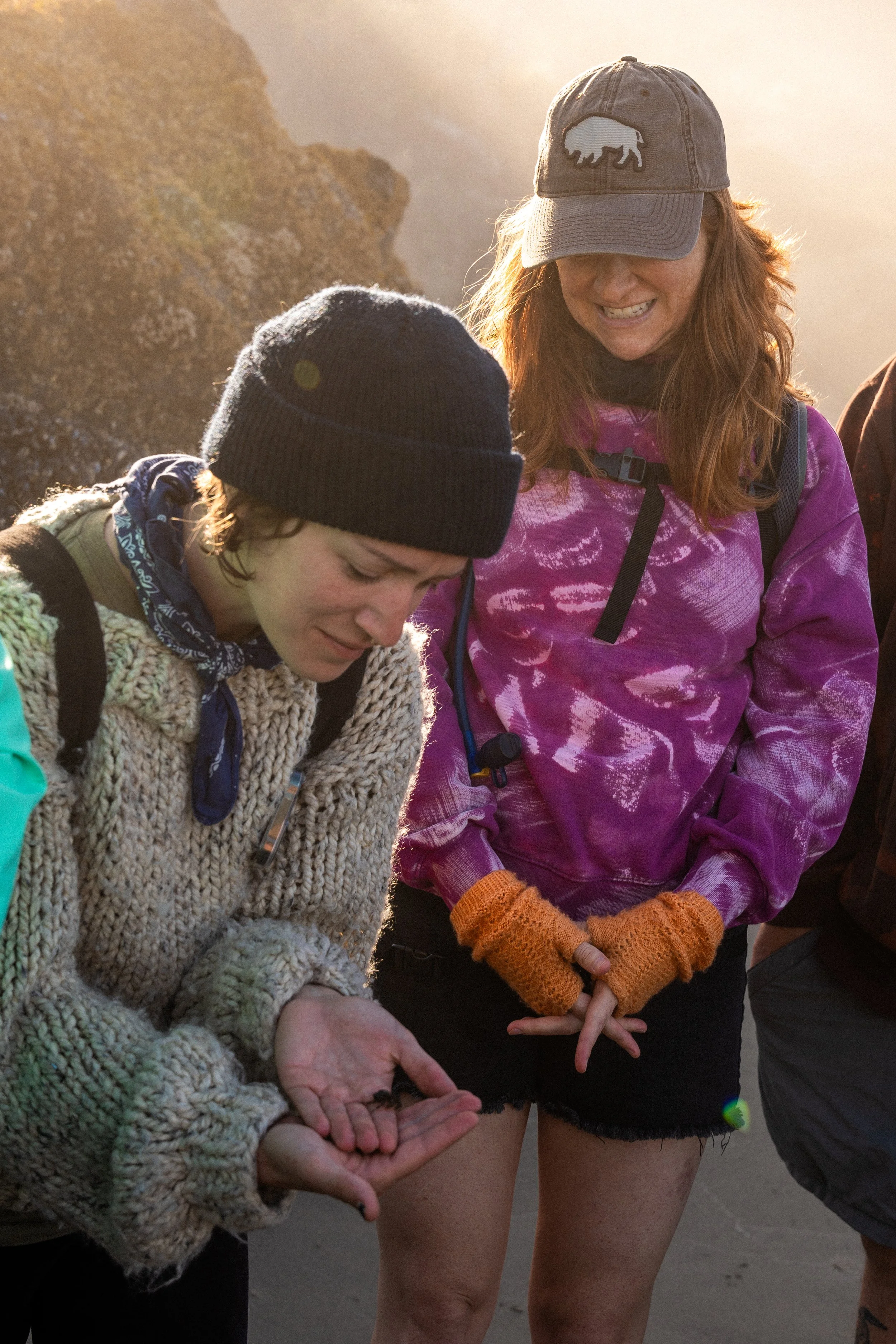
Oregon Shores Conservation Coalition is a nonprofit dedicated to protecting and preserving the Oregon coastline through community engagement, education, and long term stewardship. Through programs like CoastWatch, the organization mobilizes volunteers to monitor and care for the state’s beaches, creating a powerful connection between people and place.
Over time, the organization’s brand no longer reflected the depth of its impact or the breadth of its work. With decades of history behind it, the identity felt outdated and inconsistent, making it difficult to clearly communicate its mission and engage a new generation of supporters.
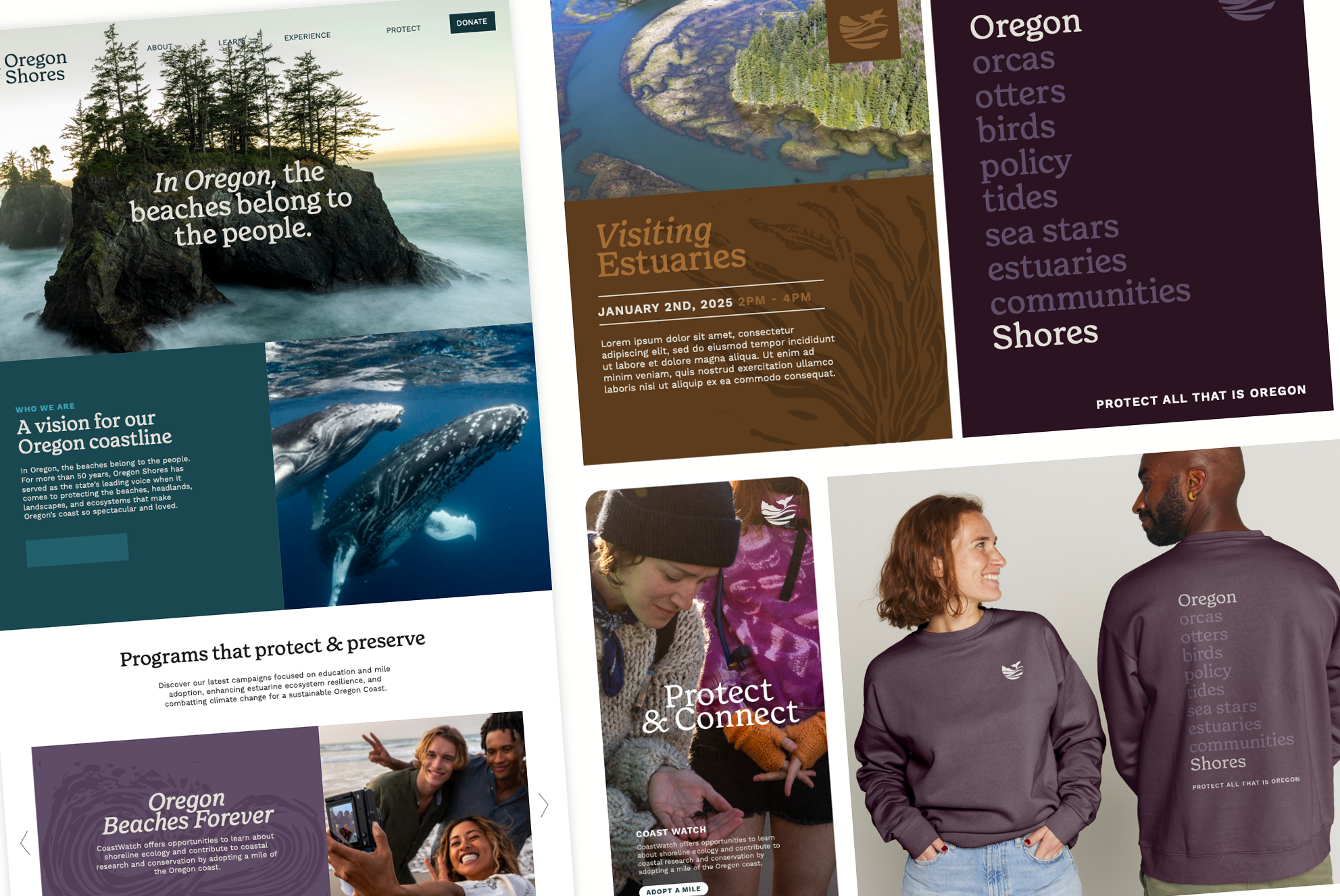
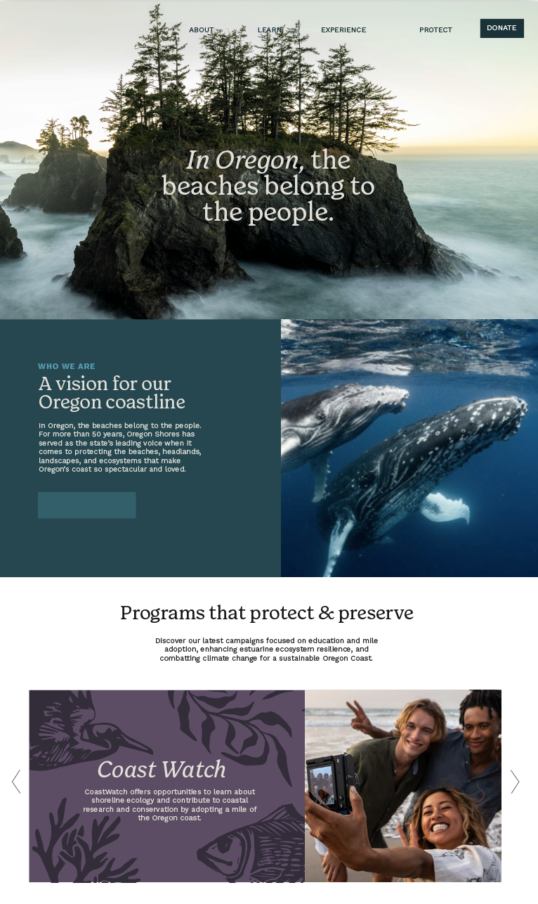
We partnered with Oregon Shores to reimagine the brand from the ground up, developing a refreshed identity and visual system that brings clarity, cohesion, and renewed energy to the organization while honoring its legacy and commitment to the coast.
BRAND STORY
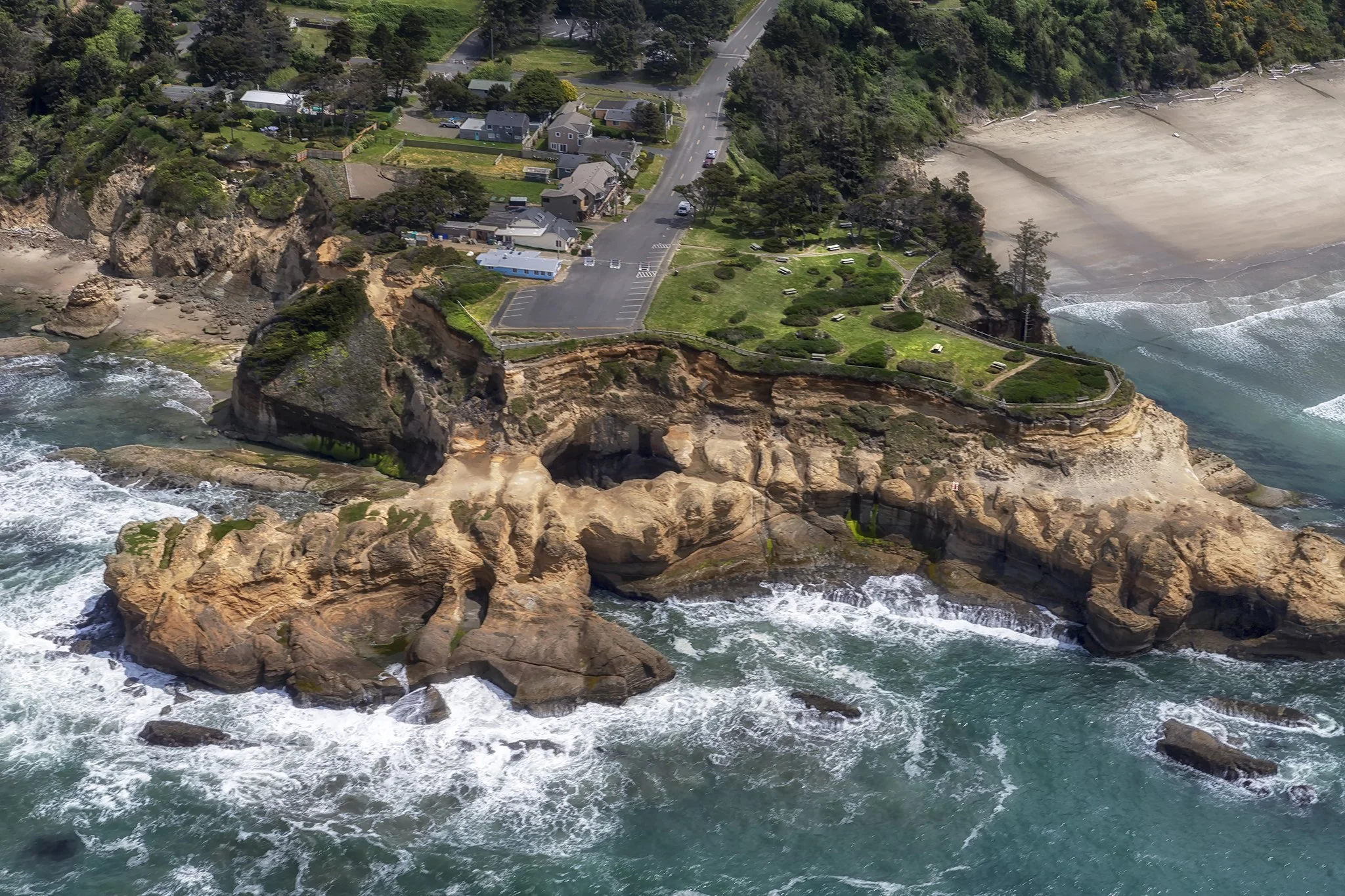
For more than 50 years, Oregon Shores has been a leading voice in protecting the beaches, headlands, and ecosystems that define the Oregon coast.
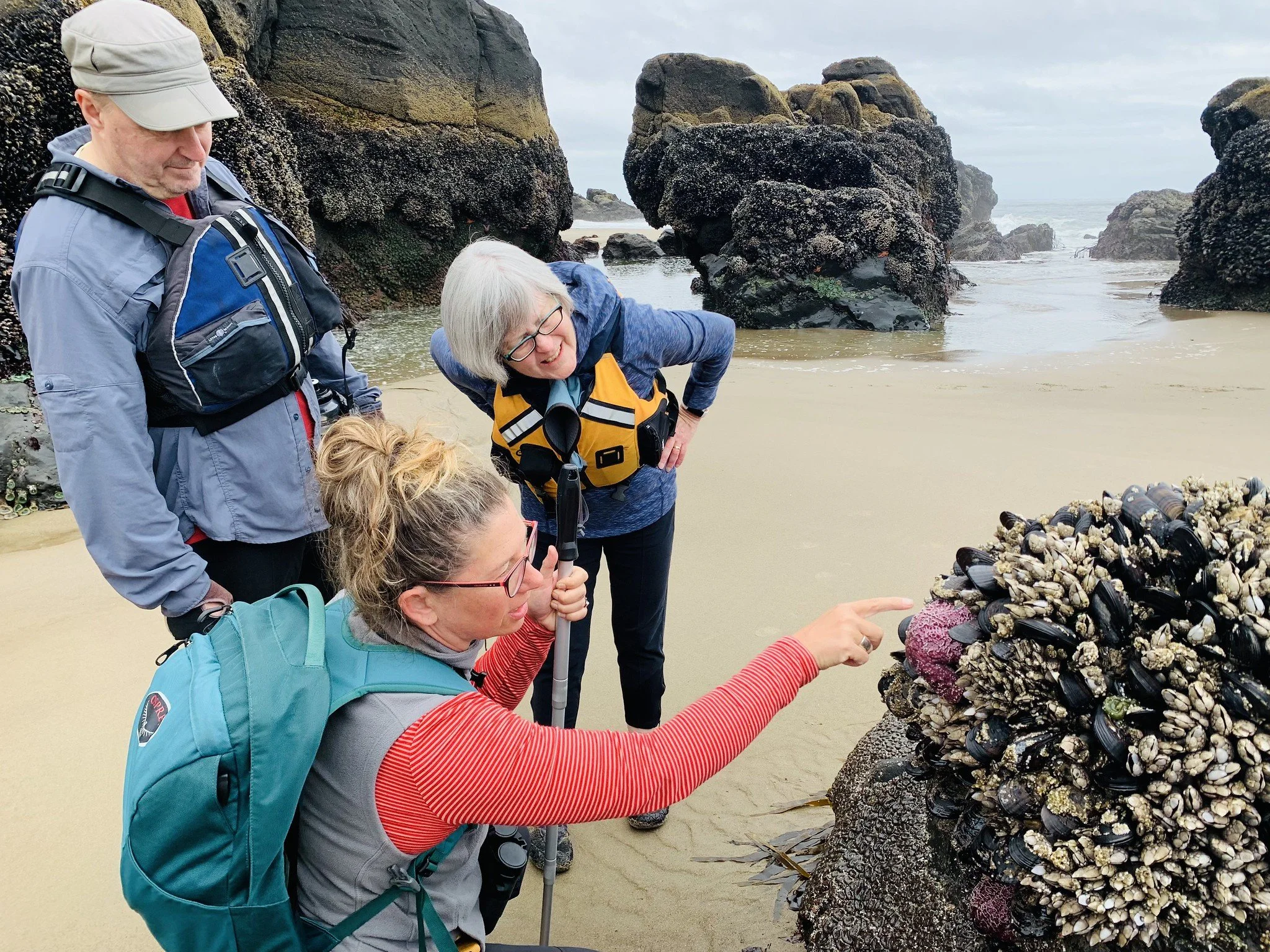
What began as a grassroots effort has grown into a statewide movement rooted in stewardship, advocacy, and community connection. Through programs like CoastWatch, volunteers play an active role in monitoring and caring for the shoreline, creating a direct and lasting relationship between people and place.
At its core, Oregon Shores is built on the belief that the coast belongs to everyone, and that its future depends on those willing to protect it. The organization continues to evolve, carrying forward a legacy of conservation while inspiring new generations to engage, observe, and take part in the work.

BRAND DIRECTION
The brand direction for Oregon Shores was shaped by a balance of legacy and renewal. With more than 50 years of impact behind it, the goal was to create a visual identity that honors the organization’s history while making it feel relevant and accessible to a new generation.
The visual language draws directly from the Oregon coast, with a palette inspired by sea, stone, and shifting light. Textures feel natural and grounded, while typography and layout bring clarity and structure to a wide range of programs and communications.
A key focus was creating a system that could unify the organization’s many touchpoints, from CoastWatch to events and advocacy efforts, ensuring consistency without losing flexibility.
The result is a brand that feels steady, credible, and deeply connected to place. One that supports the organization’s mission while making it easier for people to engage, participate, and take action.

OUR ROLE
• Brand Identity
• Brand Guidelines
• Logo Variations
• Brand Elements
• Typography System
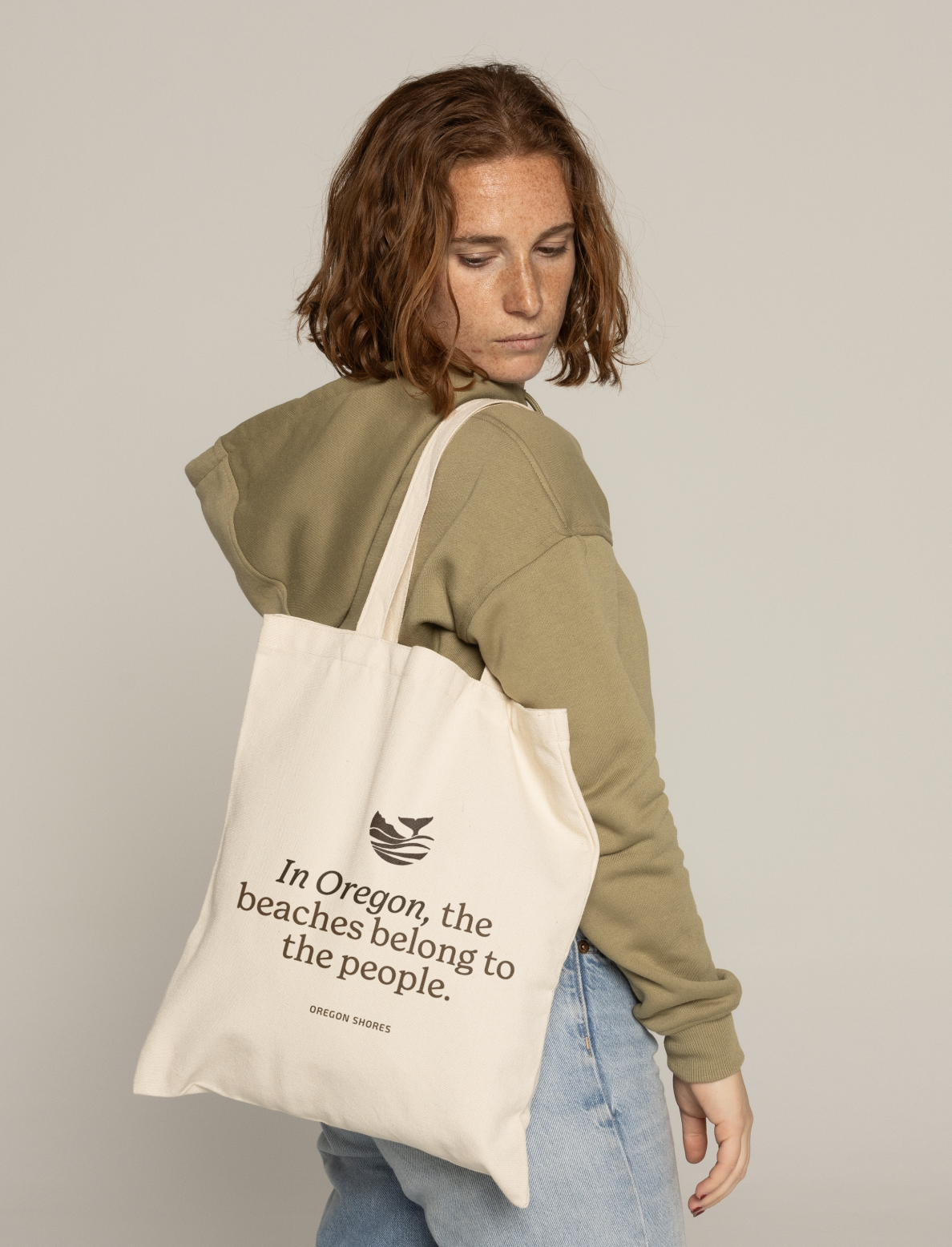
• Merchandise Design